Introduction to Dimensionality Reduction and PCA
In the field of data science, we often work with datasets that involve numerous features or variables to describe a phenomenon. However, using all these features can be cumbersome and may lead to computational challenges. Moreover, not all features contribute equally to the understanding of the underlying patterns and relationships in the data. It is desirable to represent the data using the fewest number of features while maintaining good accuracy in our analysis and predictions.
This is where dimensionality reduction techniques come into play. These techniques aim to transform the input data into a lower-dimensional representation, effectively reducing the number of features needed. One such popular technique is Principal Component Analysis (PCA).
Highly correlated features are common in many datasets, where changes in one feature tend to be associated with changes in another. For example, in financial data, the price of a stock often shows strong correlation with financial indexes or the stock prices of other companies in the same industry. Similarly, in customer purchasing patterns, certain items like shampoo and conditioner tend to be purchased together. In climate data, temperature and humidity often exhibit a strong correlation. Even in cases where you have two temperature sensors measuring atmospheric temperature in close proximity, their readings will typically be highly similar.
Given the correlation among these features, it becomes advantageous to represent them using a single or fewer features. This is precisely where PCA proves valuable. PCA takes the original data and maps it to a lower-dimensional feature space in a way that maximizes the variance of each new dimension. Each dimension in PCA is a linear combination of all the original features, resulting in a loss of direct interpretability of the new dimensions. However, the trade-off is that we can effectively represent the dataset using fewer dimensions, providing a concise overview of the data.
By applying PCA, we can reduce the dimensionality of the dataset and extract the principal components that capture the most significant variations in the data. These components can then be used to visualize the data, identify macro-trends, or even serve as input features for subsequent analysis or machine learning models.
In the upcoming sections, we will explore the steps involved in PCA, discuss the standardization of data, analyze the explained variance, and examine how PCA can aid in noise reduction and feature interpretation. Through this journey, we aim to demonstrate the utility and insights that PCA can provide in simplifying complex datasets.
Dataset
For the purpose of this analysis, I have obtained a sample dataset from Kaggle that focuses on predicting credit risk customers. The dataset provides data about the credit profiles of individuals. The dataset can be accessed here.
We have extracted four numerical columns from the dataset, which will serve as our input features for the PCA analysis. These columns are as follows:
- duration: The loan duration in months. This feature represents the length of time for which the loan is granted to the account holder.
-
credit_amount: The amount of credit extended to the account holder. This feature reflects the total credit limit or loan amount associated with the account.
-
installment_commitment: The installment rate, expressed as a percentage of the monthly disposable income. This feature indicates the portion of the account holder’s income that is committed to repaying the loan or meeting installment payments.
- age: The age of the account owner. This feature provides information about the account holder’s age, which can be a significant factor in credit risk assessment.
Domain expertise is crucial for a comprehensive understanding of the dataset, but even so we can still leverage this sample data to demonstrate the potential insights that PCA can offer. By applying PCA to these four numerical features, we aim to uncover underlying patterns, identify correlations, and gain a holistic view of the credit risk dataset.
The following code will import all the necessary libraries, remove any rows in the numerical columns that have NaN (or missing) values and then converts the data into a numeric array:
import joblib
import matplotlib.pyplot as plt
import numpy as np
import pandas as pd

from sklearn.decomposition import PCA

plt.style.use('ggplot')

df = pd.read_csv('credit_customers.csv')
columns = [ 'age', 'credit_amount','installment_commitment', 'duration']

#remove empty rows from the data from the columns that we are interested in
df = df.dropna(subset=columns)

# extract the columns that we are interested in and convert them to numpy array
X = df[columns].values
PCA Overview
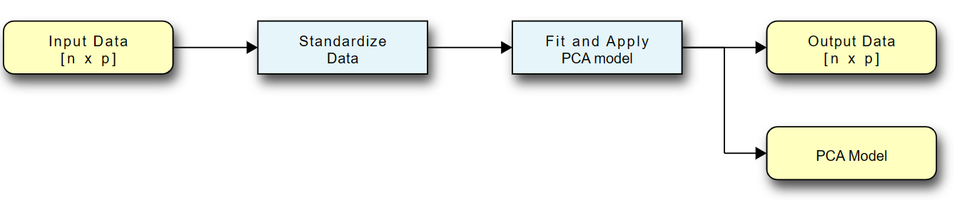
The pipeline for data flow from input data to the transformed output data is shown:
- The input into PCA is a set of numerical features with \(p\) dimensions and \(n\) data points. These features represent the measurements or attributes that describe each data point.
- To prepare the data for PCA, it is important to standardize each feature. This standardization process involves scaling the data so that each feature has a mean of 0 and a standard deviation of 1 along its dimension. Standardization ensures that each feature contributes equally to the PCA analysis and prevents features with larger scales from dominating the results.
- The standardized data is then used to fit the PCA model. This step involves calculating the covariance matrix of the standardized data, which measures the relationships and variability between different features. The eigenvectors and eigenvalues of the covariance matrix are computed through eigenvalue decomposition or singular value decomposition (SVD).
- Once the PCA model is fitted, it can be used to transform the original data into a lower-dimensional space. The transformation involves projecting the data onto the principal components, which are the eigenvectors of the covariance matrix. The resulting output data has the same number of data points \(n\), but the number of dimensions is reduced to \(k\), where \(k\) is the desired number of principal components.
- The transformed output data is technically a matrix of size \(k\) by \(n\). The principal components are ordered by the amount of variance they explain, with the first component explaining the highest variance. By analyzing the explained variance ratios of the principal components, you can determine the amount of information retained after dimensionality reduction. Typically, you can discard the principal components that contribute less to the overall variance, reducing the dimensionality of the data further if desired.
By following this PCA pipeline, we can effectively reduce the dimensionality of the data while preserving important patterns and structures. The reduced-dimensional representation can facilitate visualization, analysis, and further modeling tasks.
Standardization
Standardization is an important preprocessing step in PCA to ensure that each feature contributes equally and is not dominated by differences in scale. The standardization process transforms the data to have a mean of 0 and a standard deviation of 1 along each feature dimension. This has two main benefits:
- Mean Shift: Shifting the data to have a zero mean removes any bias that may be present in the original feature values. It ensures that the principal components are not influenced by the mean of the data.
- Scaling: Standardizing the features is necessary when they have different magnitudes. By scaling each feature to have a standard deviation of 1, no single feature will dominate the PCA analysis based on its larger scale.
Standardization is performed along each feature dimension separately. The following equation will need to be applied to each feature:
\[new\;point = \frac{(measurement - average)} {standard\;deviation}\]Let’s take a look at an example using a numpy array for standardization and visualize the results:
# Standardize the data
X_standardized = (X - np.mean(X, axis=0)) / np.std(X, axis=0)

# Plot the results side by side to compare
fig, axes = plt.subplots(1, 2, figsize=(15, 5))

# plot original data
axes[0].scatter(X[:, 0], X[:, 1], alpha=0.25)
axes[0].set_title('Original Data')
axes[0].set_xlabel('Age')
axes[0].set_ylabel('Credit Amount')

# plot standardized data
axes[1].scatter(X_standardized[:, 0], X_standardized[:, 1], alpha=0.25)
axes[1].set_title('Standardized Data')
axes[1].set_xlabel('Age')
axes[1].set_ylabel('Credit Amount')

plt.show()
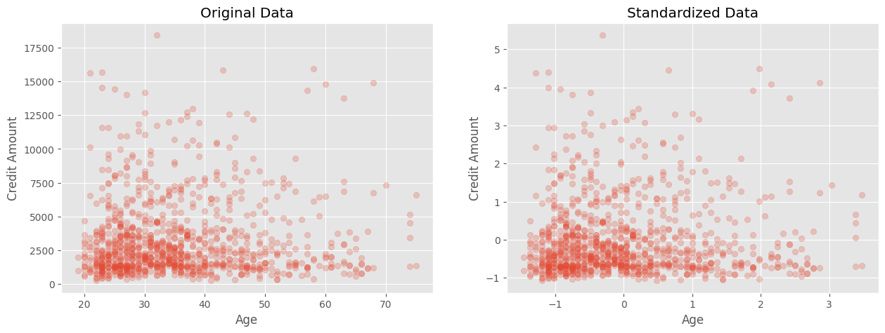
In the plots, the left figure represents the original data, while the right figure shows the standardized data. Although the shape and relative position of the points remain the same, you can observe that the scales of the x and y axes have changed. Previously, each variable had its own average and scale, but after standardization, each variable is centered at 0 and has a similar magnitude. The use of transparency in the scatter plot helps highlight the underlying patterns when there are overlapping points. I strongly endorse the use of transparency (alpha parmeter) in plotting to help visualize patterns and groupings of data.
PCA Transformation
Once we have preprocessed our data and standardized the features, we can proceed with the PCA transformation. This step involves mapping our original data to a lower-dimensional space while maximizing the variance captured by each new dimension, or principal component. The PCA transformation can be summarized into a few steps:
- Compute the covariance matrix of X, which will be a \(p\times p\)-dimensional matrix, where \(p\) is the number of input features. For the example that I am using it will be \(4\times 4\) dimensions.
- Perform Eigenvalue decomposition on the covariance matrix, where the eigenvectors represent the direction along which the data varies the most and the eigenvalues represent the magnitude of the variation along each eigenvector. Don’t worry if the previous does not mean much to you as you can still use PCA without understanding it. It has been shown that the Eigenvalue decomposition results in a linear transformation od the data that maximizes the variance. The derivation is straight-forward, but does involve Lagrange multipliers and differentiation so it may not be for everyone.
- Select number of principal components. Rank the eigenvectors by their corresponding eigenvalues. The first vector explains the most variance. The last one the least. It depend on the outcome of your data, but here you can select the top n eigenvectors to retain.
- Transform the data. Now that we know how many principal components we want, we take the data and transform it into the lower dimensional space and use the result for visualization, prediction, etc. Note that none of the tutorials on PCA tell you to save the PCA model for future transformations. If you get additional data coming in that you want to transform in the same way as your old data, then you will need the original transformation.
The scikit-learn PCA module provides a convenient way to perform these steps without requiring an in-depth understanding of the underlying implementation details. It is strongly recommended to explore the module with sample data to gain hands-on experience and understand its functionality. Let’s start by applying PCA with all four principal components, which means no dimension reduction and a linear transformation of the data.
# Fit a PCA model to the data and reduce the dimensions
pca = PCA(n_components=4)

# transform the data
X_pca = pca.fit_transform(X_standardized)
Now we want to assess how effectively PCA can explain the variance in the data, which refers to reducing the number of dimensions while preserving as much of the data’s variation as possible. The explained variance ratio for each principal component can provide insights into this aspect. The explained variance ratio is calculated by dividing the eigenvalue of each principal component by the sum of the eigenvalues of all components.
fig, ax = plt.subplots(figsize=(10, 5))
ax.bar(np.arange(1, 5), pca.explained_variance_ratio_)
ax.set_xticks(np.arange(1, 5))
ax.set_xlabel('Principal Component')
ax.set_ylabel('Explained Variance Ratio')
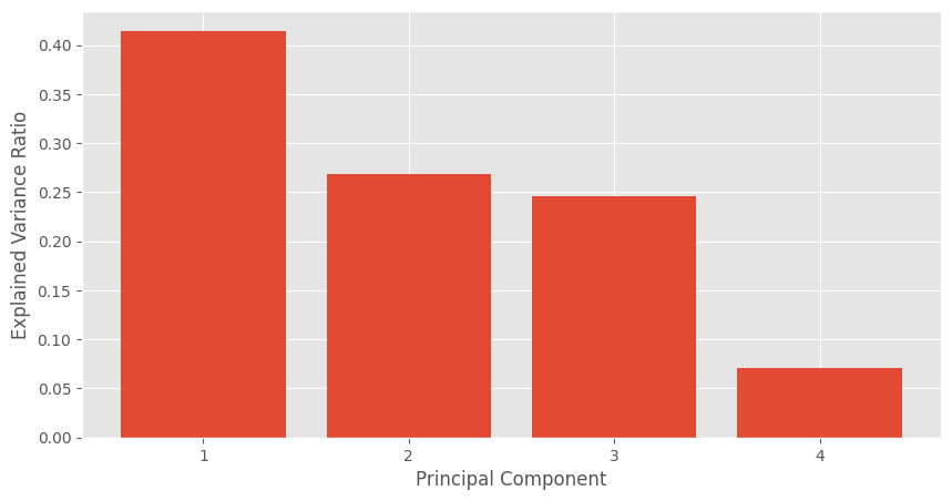
In the aboe plot, the first principal component explains 40% of the variance. Meaning that if we only used 1 component, we would still see about 40% of the variation of the data. The 2nd and 3rd components explain about 25% each so if we were to transform our original 4 features to the 3 transformed PCA features, then we would still be able to retain about 90% of the variance. Note that most textbooks will use a threshold of 90% to 95% as a suggested cutoff when deciding on the number of retained components.
What does it mean that we can represent the data using only 3 linearly transformed feature out of the 4 original input features? It suggests that there is a high degree of correlation among the features, indicating the possibility of redundancy. It is not immediately clear which one it could be and we will need other methods to eke out that information. One approach is to compute the covariance matrix using the numpy library or utilize the get_covariance() function provided by the PCA module, as it performs this computation internally:
x_corr = pca.get_covariance()

#plot the correlation matrix as a heatmap and write out the values in the cells
fig, ax = plt.subplots(figsize=(10, 10))
im = ax.imshow(x_corr, cmap='coolwarm')
ax.set_xticks(np.arange(4))
ax.set_yticks(np.arange(4))
ax.set_xticklabels(columns)
ax.set_yticklabels(columns)
ax.set_xlabel('Features')
ax.set_ylabel('Features')
ax.set_title('Correlation Matrix')
for i in range(4):
    for j in range(4):
        text = ax.text(j, i, np.round(x_corr[i, j], 2), ha="center", va="center", color="k", fontdict={'size': 14, 'weight': 'bold'})

# add a colorbar
fig.colorbar(im, ax=ax)
ax.set_title('Correlation Matrix')
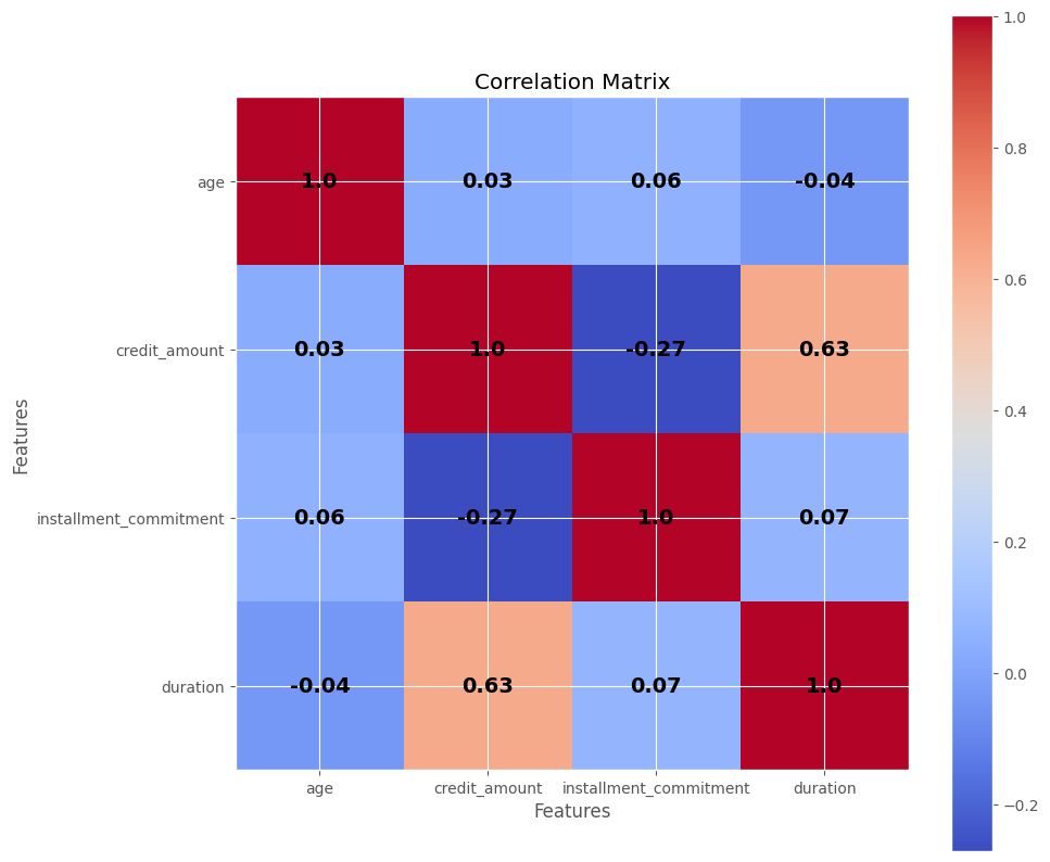
The generated correlation matrix visually depicts the correlations among the features. For example, with a correlation value of 0.63, the duration feature shows a moderate correlation with the credit_amount variable. Both input features exhibit a positive correlation, indicating that as one increases, the other tends to increase as well. However, a correlation of 0.63 alone is not sufficient to deem one of the variables redundant, as there might still be additional information captured by both features. It’s important to note that correlation only captures linear relationships and may not capture more complex non-linear associations. Domain expertise can be valuable in determining which, if any, variables can be pruned, but in this case, it would be reasonable to retain all 4 input variables.
PCA Final Steps
We have just now decided to keep all 4 input features, but use PCA to transform them into 3 dimensions. What are the advantages/disadvantages of using PCA:
Advantages:
- You have effectively reduced the number of dimensions of your input data, which will allow you to train machine learning models faster and with potentially fewer parameters. In the example in this post, we had a reduction of only 1 dimension, but this could be huge in datasets with 100s of input features. PCA alleviates the curse of dimensionality and you may need fewer parameters to effectively represent your data.
- You can potentially visualize the data better if you have 2 principal components that explain a large percentage of the variance, which will aid you in deciding if there are certain clusters, patterns, or separations.
- PCA can effectiveky reduce the noise in your data if you take the top portion of components that explain most of the variance. By doing that you emphasize the signal while attenuating the effect of the noise
Disadvantages:
- You still need to collect all the input features, since PCA is a transformation that requires all of the input features.
- You lose a bit of explainability since any coefficients are now part of the transformed variables. You lose thedirect inter You can back-calculate the importance of each specific input variable, but that is a more complex process.
Now, let’s proceed with the final steps of the PCA transformation and save the model using the joblib package:
# Fit a PCA model to the data and reduce the dimensions
pca = PCA(n_components=3)

# fit the model to the standardized data and transform it
X_pca = pca.fit_transform(X_standardized)

# Save the model to file for later use
joblib.dump(pca, 'pca_model.pkl')

# Load the model from file to make sure it worked
pca = joblib.load('pca_model.pkl')
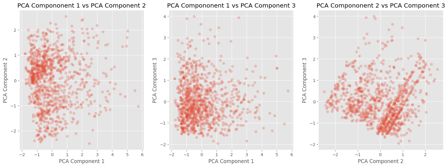
The dimensions of our standardized data were originally \(1000 \times 4\), and after applying PCA, the transformed data now has dimensions of \(1000 \times 3\). This transformed data can be used as input features for prediction models or for visualization purposes. The following plots demonstrate some patterns and clusters in the transformed data that can be further investigated. It’s important to note that the retained components account for more than 90% of the variance, indicating that most of the important information is preserved.
# plot the pca_coponents against each other in a 3 by 1 grid
fig, axes = plt.subplots(1, 3, figsize=(18, 6))

for idx, (i,j) in enumerate([[0,1], [0,2], [1,2]]):
    axes[idx].scatter(X_pca[:, i], X_pca[:, j], alpha=0.25)
    axes[idx].set_title(f'PCA Compononent {i+1} vs PCA Component {j+1}')
    axes[idx].set_xlabel(f'PCA Component {i+1}')
    axes[idx].set_ylabel(f'PCA Component {j+1}')
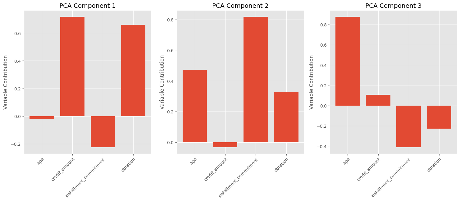
Additionally, we can visualize the contribution of each input variable to each principal component. Since PCA is a linear transformation, each component is composed of a combination of the input variables. For example, the chart shows that PCA Component #3 is approximately composed of:
\[0.85 \times Age + 0.1 \times credit\;amount -0.4 \times installment\;commitment -0.2 \times duration\]In this case, the age and installment commitment variables dominate, while credit amount and duration have relatively smaller contributions. It is worth noting that interpretability is not guaranteed, and further domain expertise may be required to make meaningful interpretations.
variable_contributions = pca.components_

# print a subplot of 3 by 1 with the variable contributions for each of the 3 principal components
fig, axes = plt.subplots(1, 3, figsize=(18, 6))

for idx, ax in enumerate(axes):
    ax.bar(np.arange(1, 5), variable_contributions[idx])
    ax.set_xticks(np.arange(1, 5))
    ax.set_ylabel('Variable Contribution')
    ax.set_title(f'PCA Component {idx+1}')

    # change the xtick labels to the feature names rotated at 45 degrees and offset to the right by 0.5
    ax.set_xticklabels(columns, rotation=45, ha='right', rotation_mode='anchor', x=-0.05)
Conclusion
In conclusion, PCA provides a valuable approach to dimensionality reduction, enhancing our understanding of datasets and improving computational efficiency in model building. By utilizing PCA, data scientists can uncover hidden insights through visualizations and make more informed decisions. With its ability to transform complex data into a lower-dimensional space, PCA offers a powerful tool for data analysis and exploration. Embracing PCA empowers data scientists to extract meaningful information, drive innovation, and extract maximum value from their data.